ClearSplit - A Bill Splitting App
Personal Project
Timeline
July 2021 - August 2021
Role
UX/UI Designer
Team
Solo
Overview
Problem Statement
Diners and group expense sharers lack a simple, precise, and reliable method for splitting costs, leading to confusion, overpayment, and resentment. Current solutions (manual calculations, generic apps) are often inaccurate, time-consuming, and inflexible, failing to handle complex scenarios like unequal shares, custom items, or split payments. This issue demands a new approach that guarantees fairness, transparency, and ease of use across diverse expense contexts.
Solution
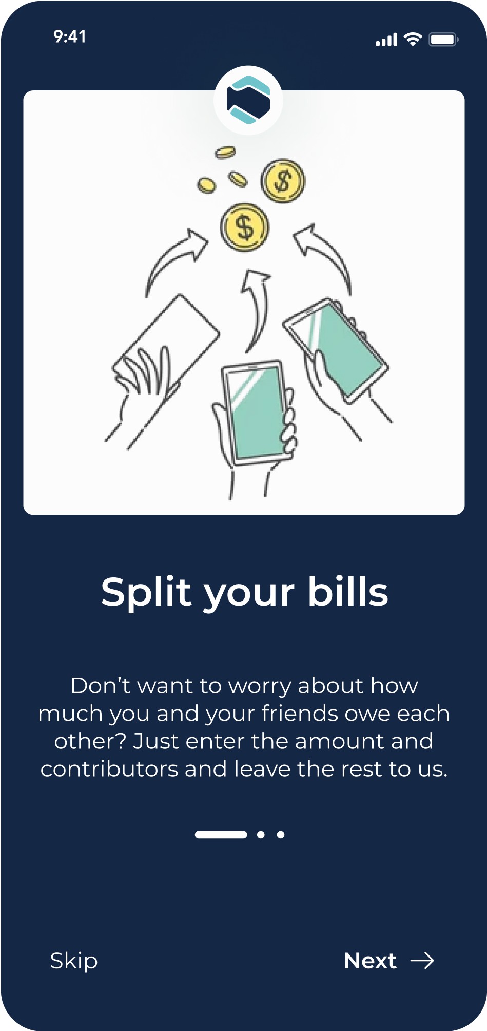
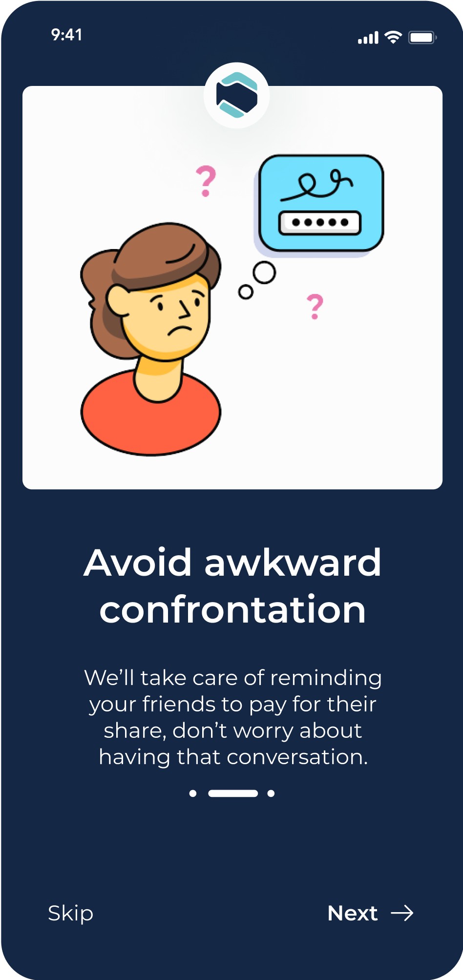
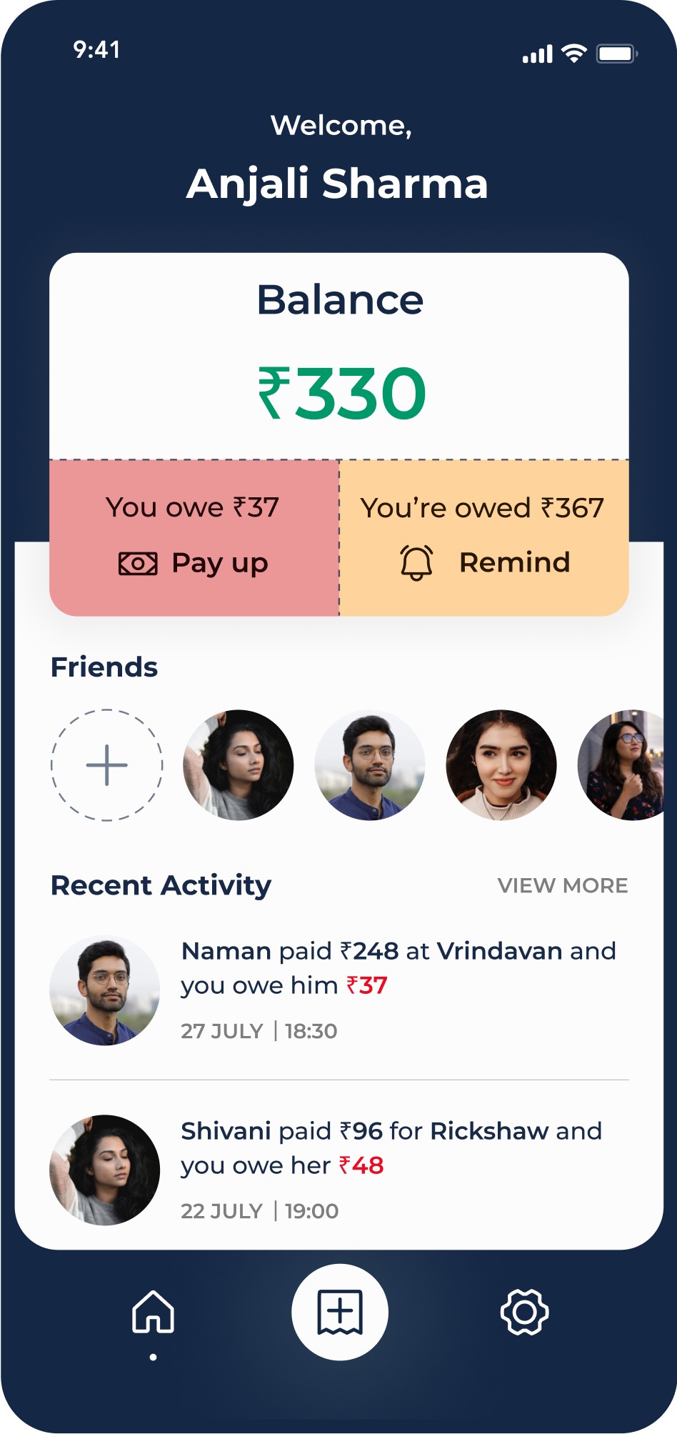
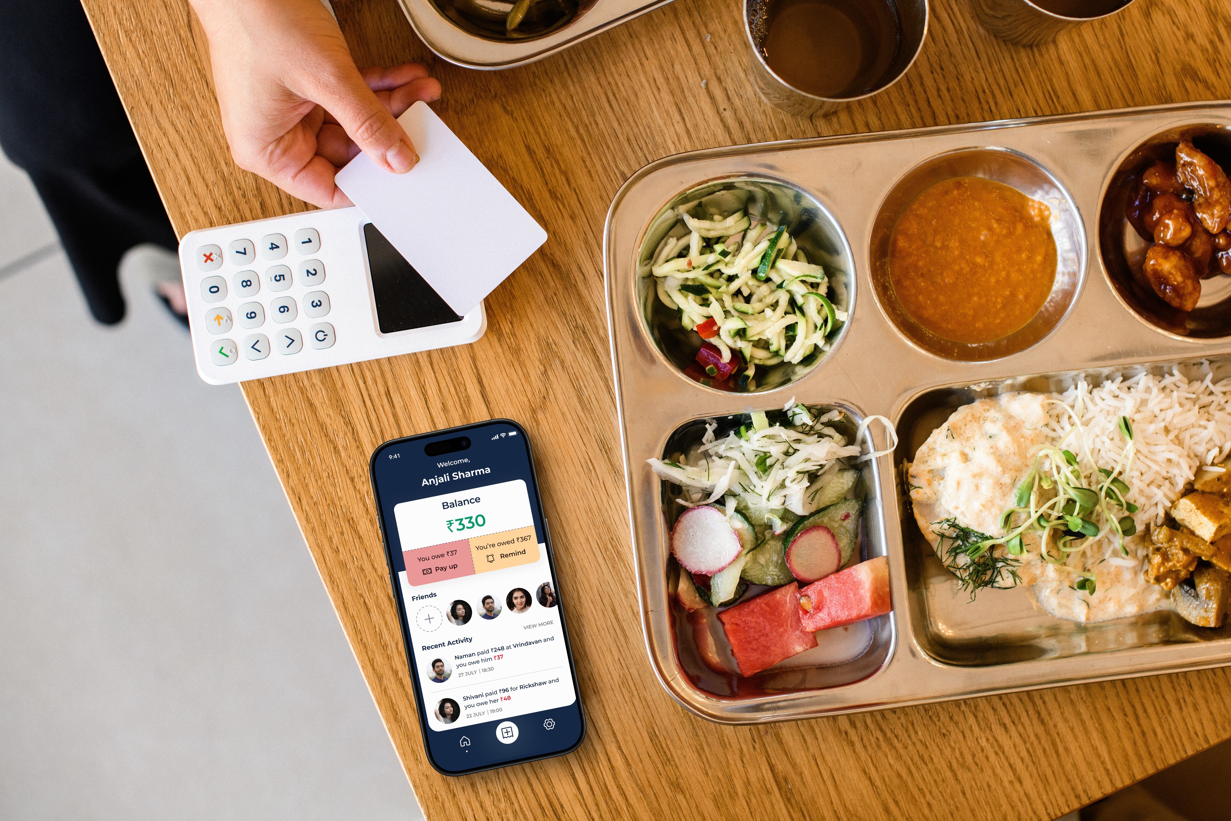
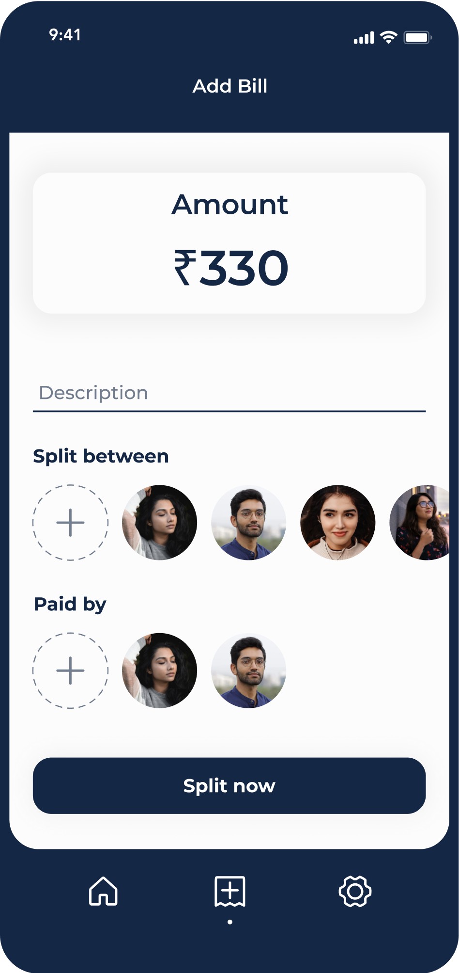
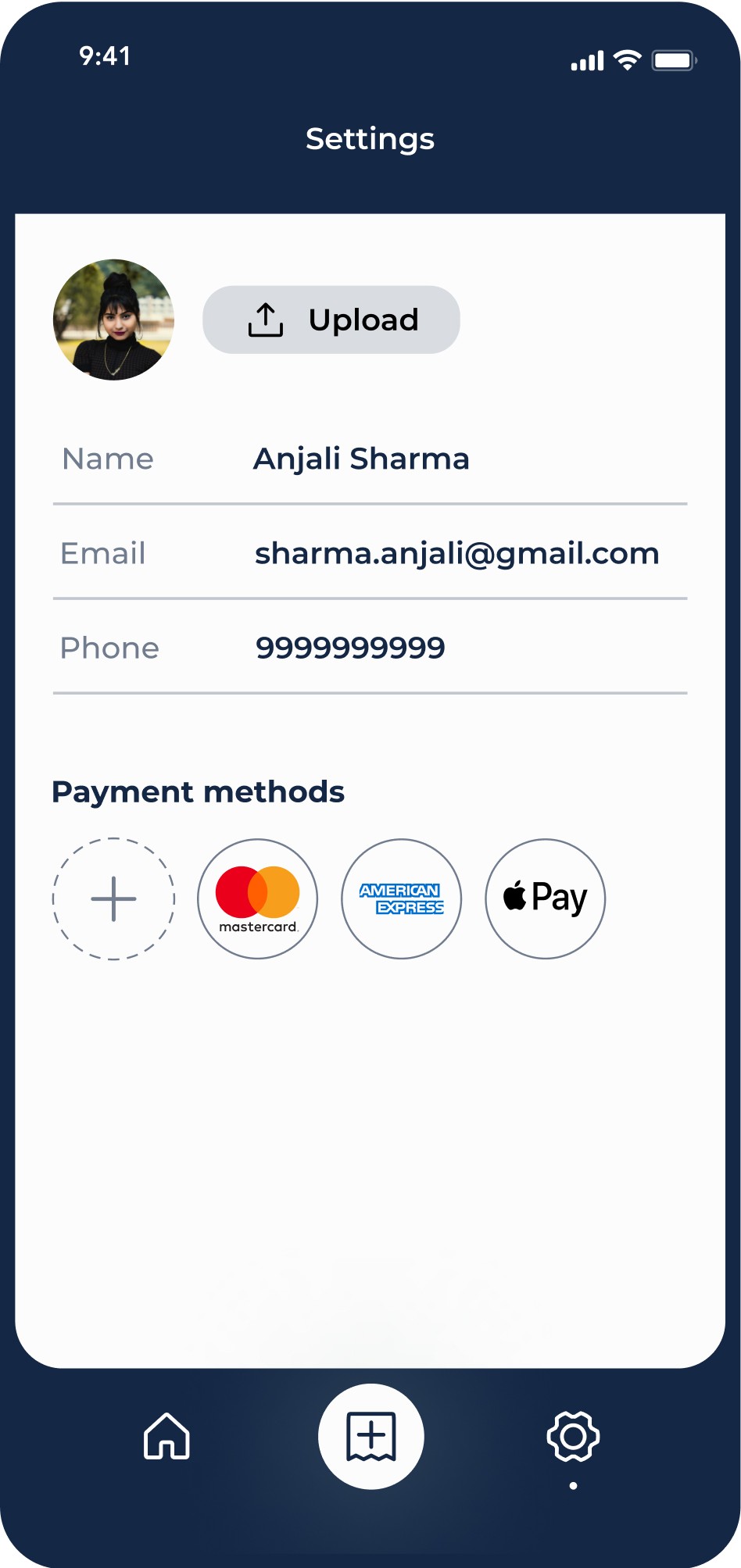
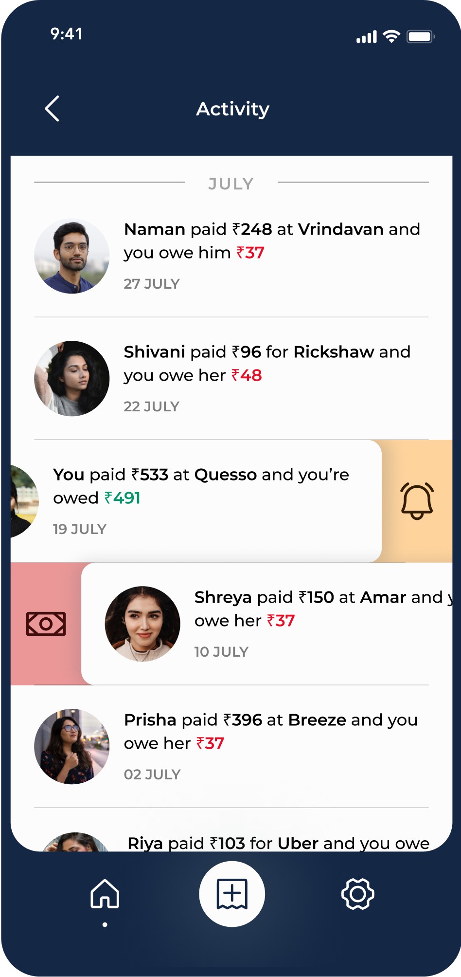
A user-centric mobile app that tackles the pain point of complex expense splitting. Its clean, clutter-free interface prioritises intuitive interaction, allowing users to add expenses, customise splits, and manage group bills with ease. The "nudge system" replaces awkward reminders with friendly notifications, fostering smoother communication and eliminating friction around collecting payments.
User Research
Survey
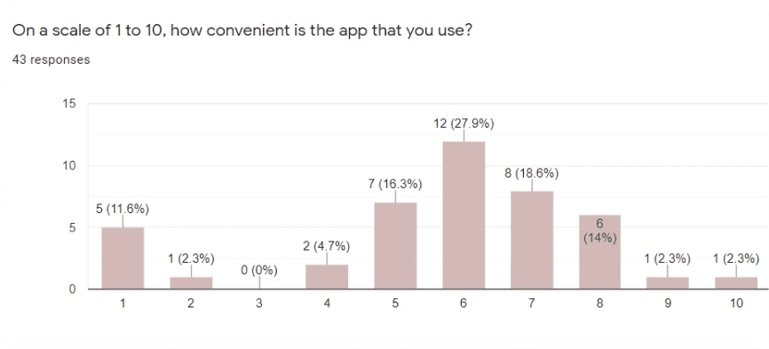
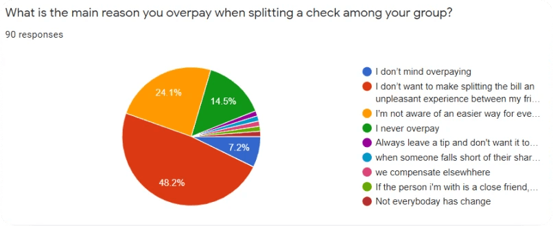
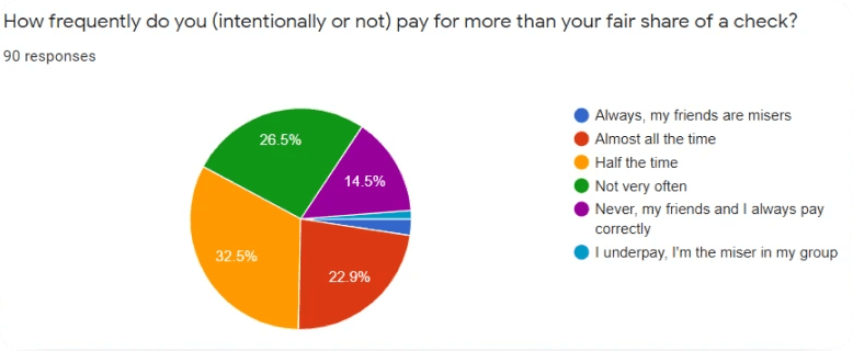
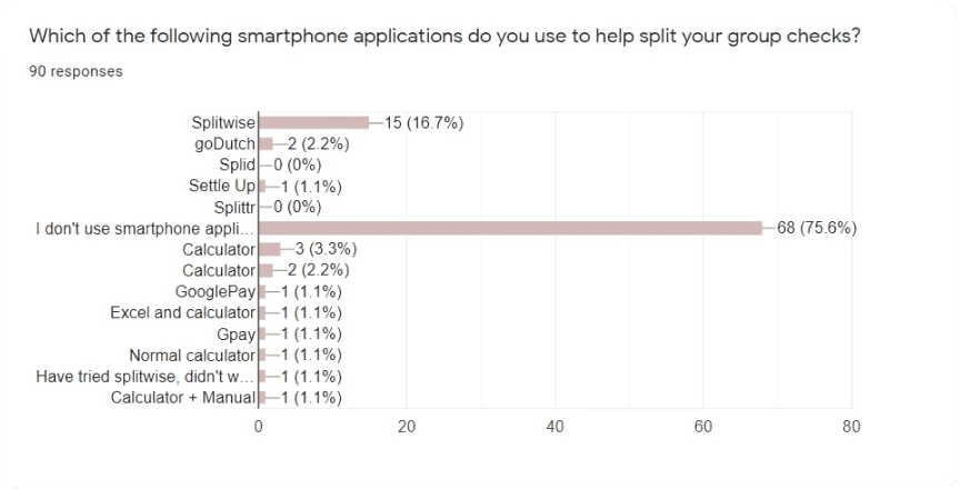
I put a list of carefully crafted questions relevant to the problem in a Google Forms survey and asked people for their inputs to identify the user pain points and their opinions on the existing solutions to know the most important features that they look for in a bill splitting application.
55%
of the respondents end up paying more than their share of a check
72%
of the respondents overpay because they either don’t know another way or don’t want to make the process unpleasant
63%
of the respondents who use an existing bill splitting application are not satisfied with it
38%
of the respondents wanted a reminder functionality in order to avoid having to ask the person who owes them money
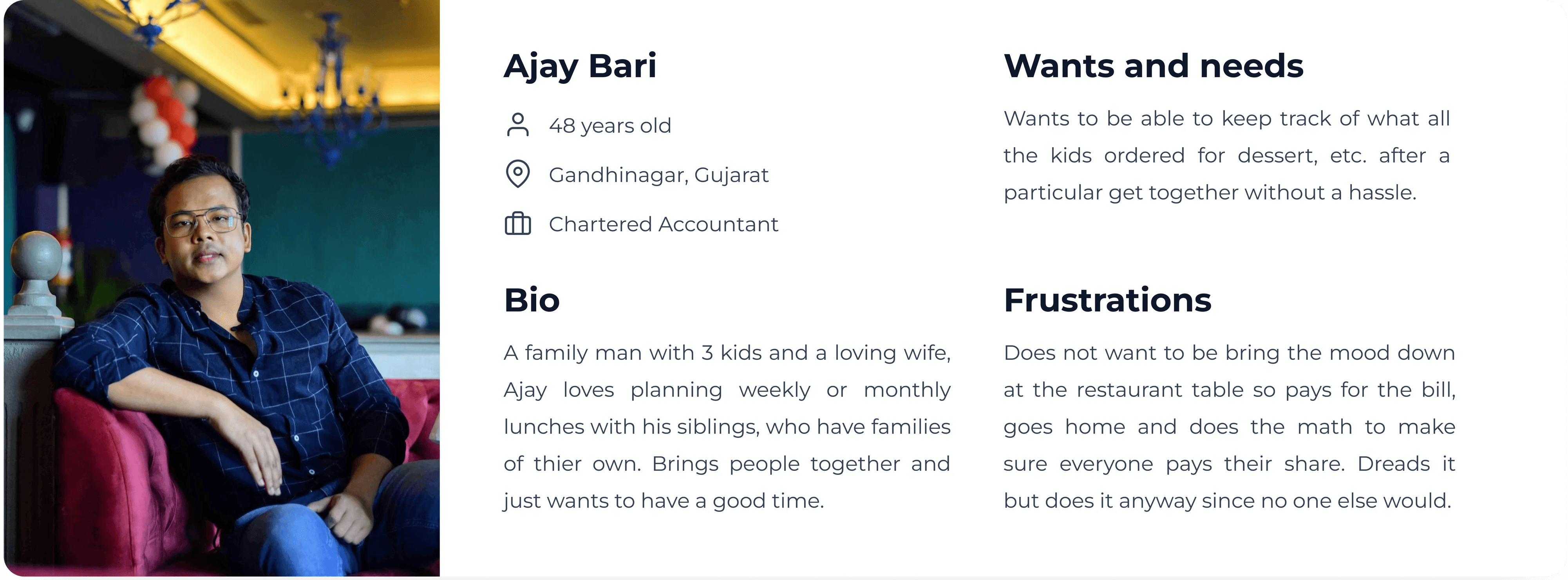
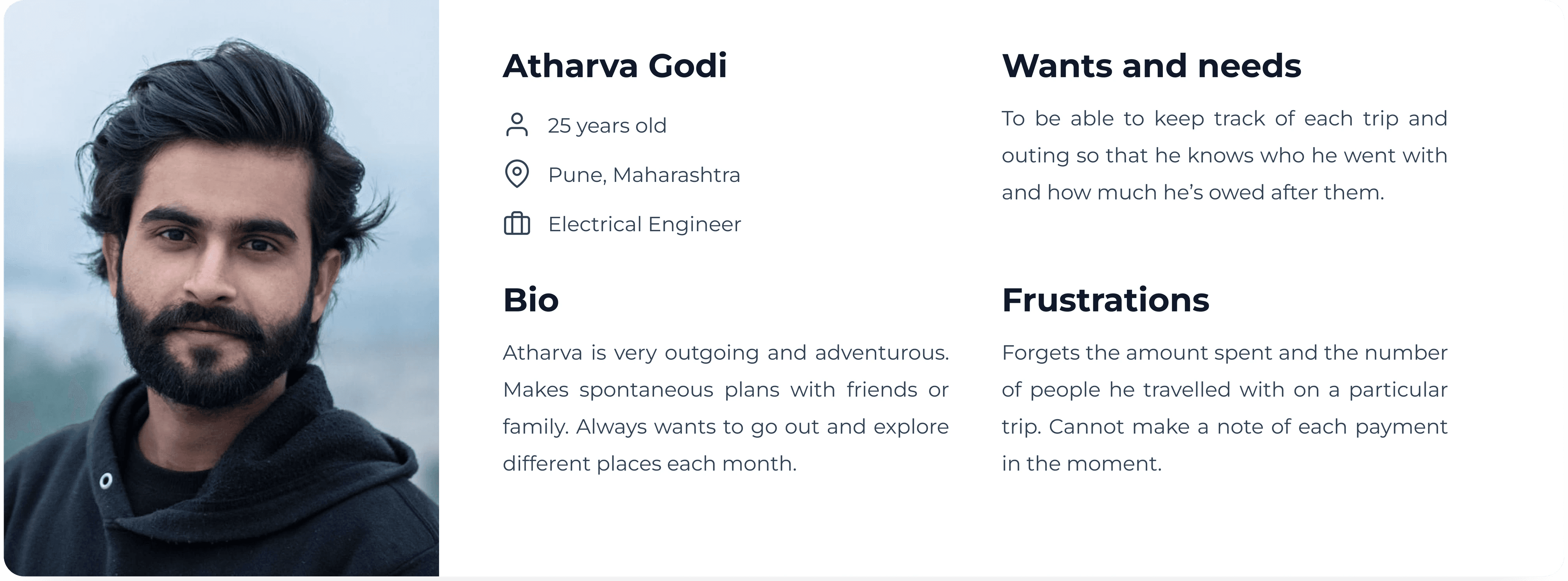
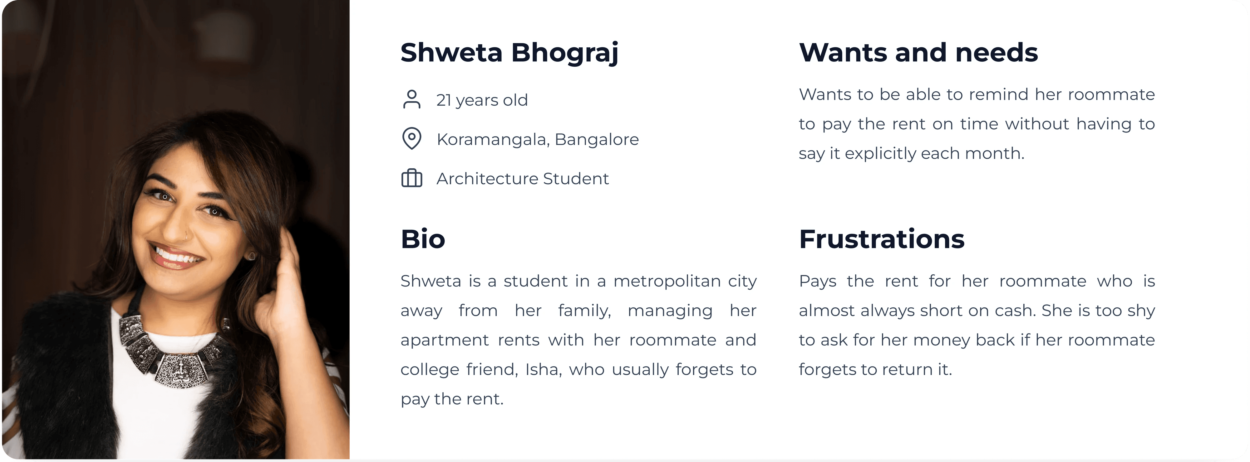
Personas
Sitemap
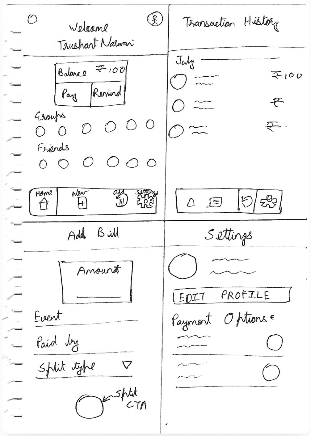
Wireframes
Here are some very basic paper wireframes I made just for reference and noting initial ideas. Several changes were made to these to get to the prototyping stage.
UI Design
Style Guide
The colour blue and its shades are used because it represents trust and loyalty which is the main idea of the application. This can also be seen in the logo which is a simplified variant of a handshake, a common gesture that signifies successful transactions.
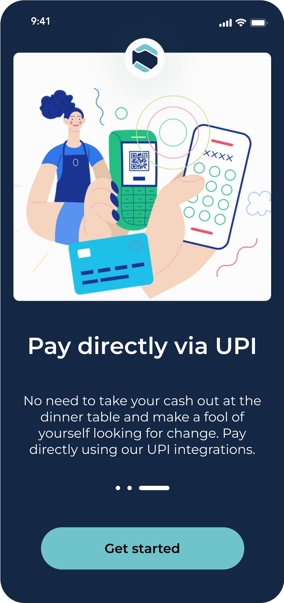
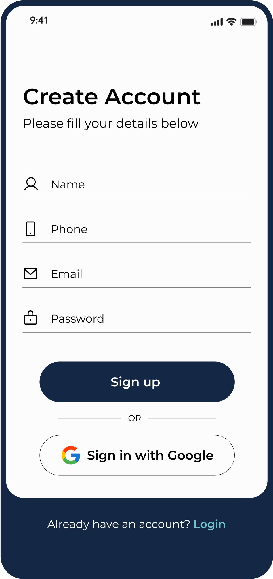
Prototype
