Enhancing the Library Experience
Interaction Design
Timeline
October 2023 - December 2023
Role
Interaction Designer
Team
Claudia Stenbaek
Gibran Khan
Jie-Shin Lin
Lilia Cheung
Trushant Narwani
Overview
In recent years, libraries have transformed from traditional book repositories into dynamic community hubs. This coursework project aimed to amplify this transformation using technology to deepen user engagement and create a more dynamic, participatory library experience.
Note: While the Wellcome Library was the focus, it was not an official partner.
Challenge
Designing a solution that enhances the library's role as a literary hub and social space while improving event discovery, service accessibility, and overall user participation in library activities.
Solution
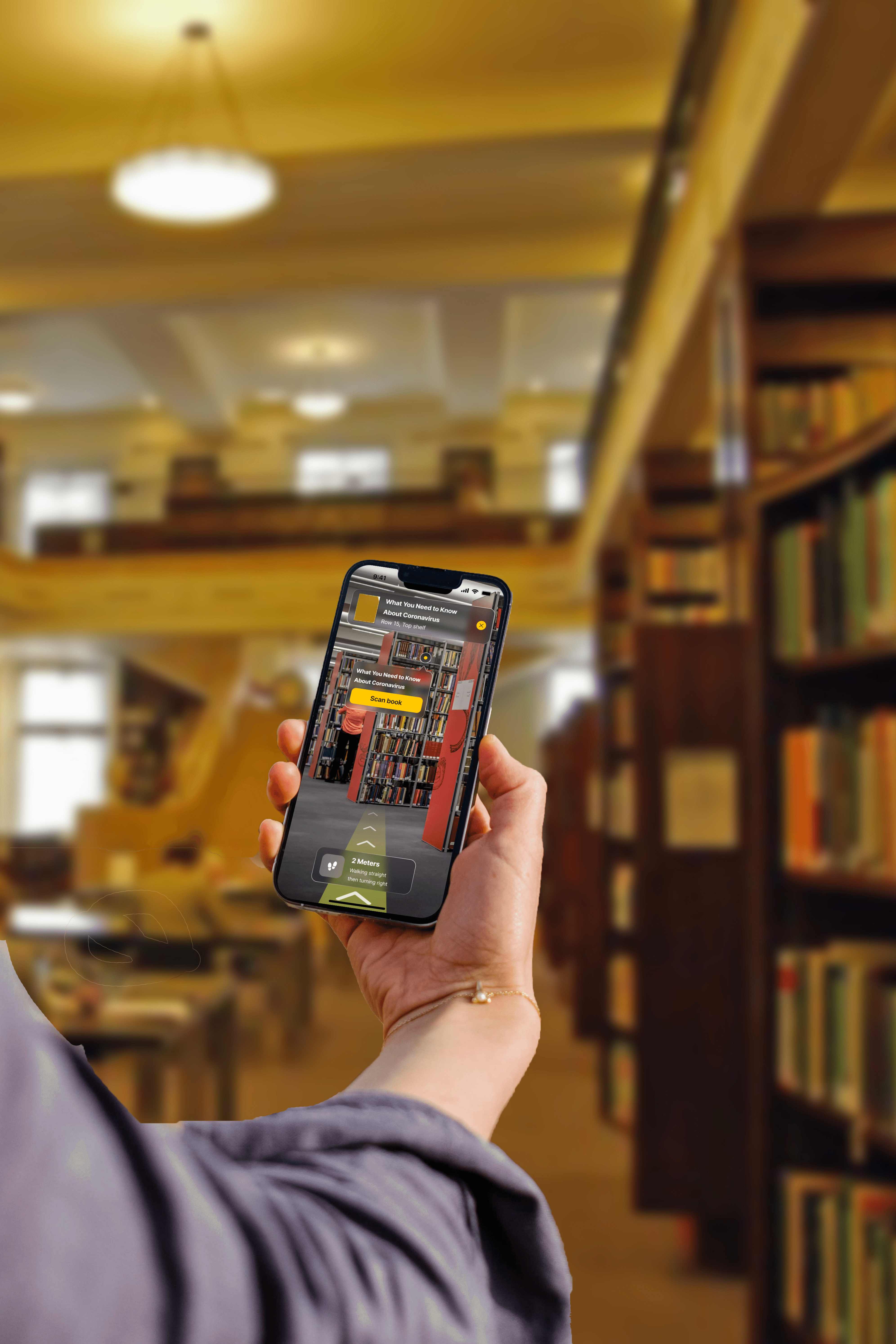
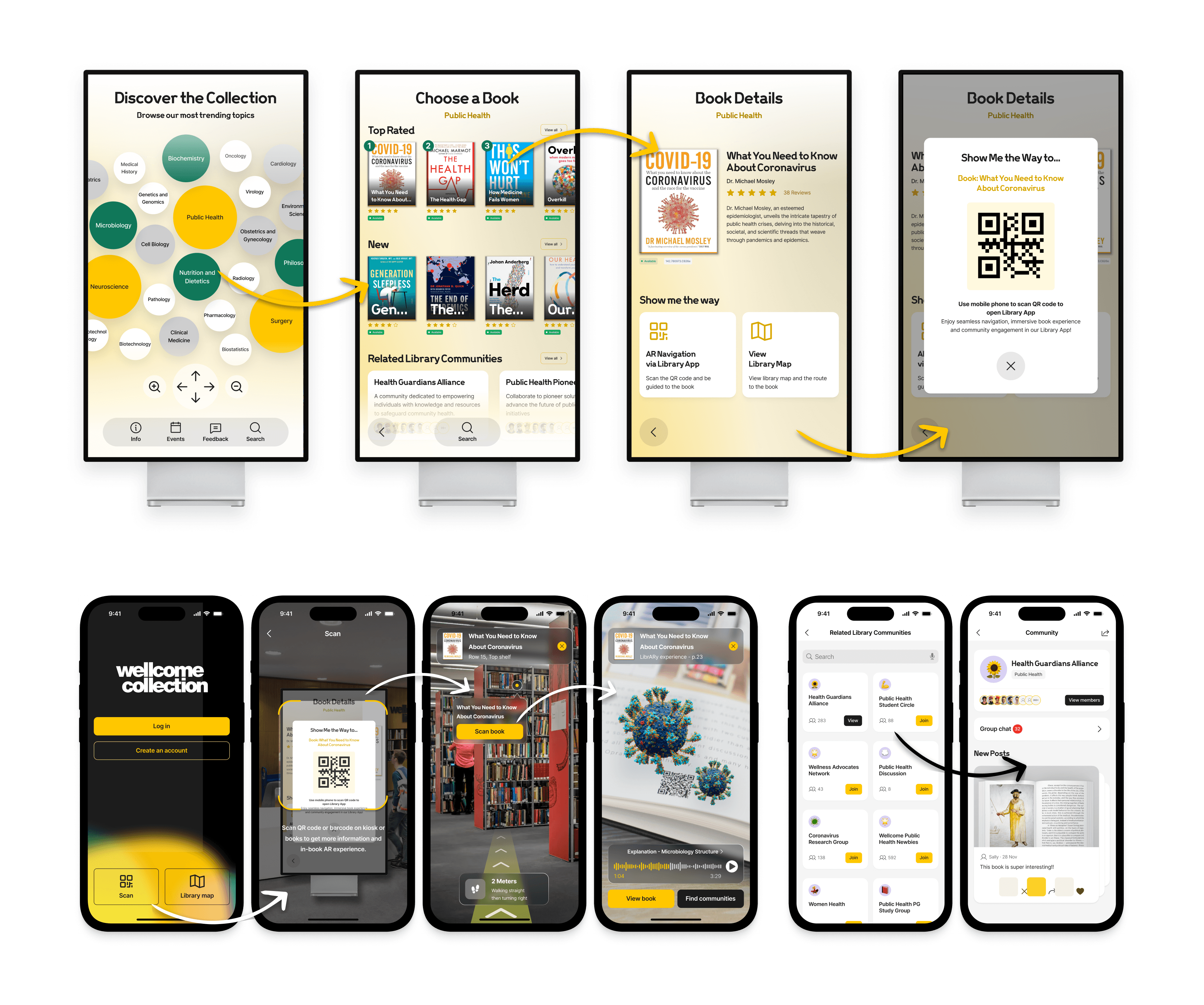
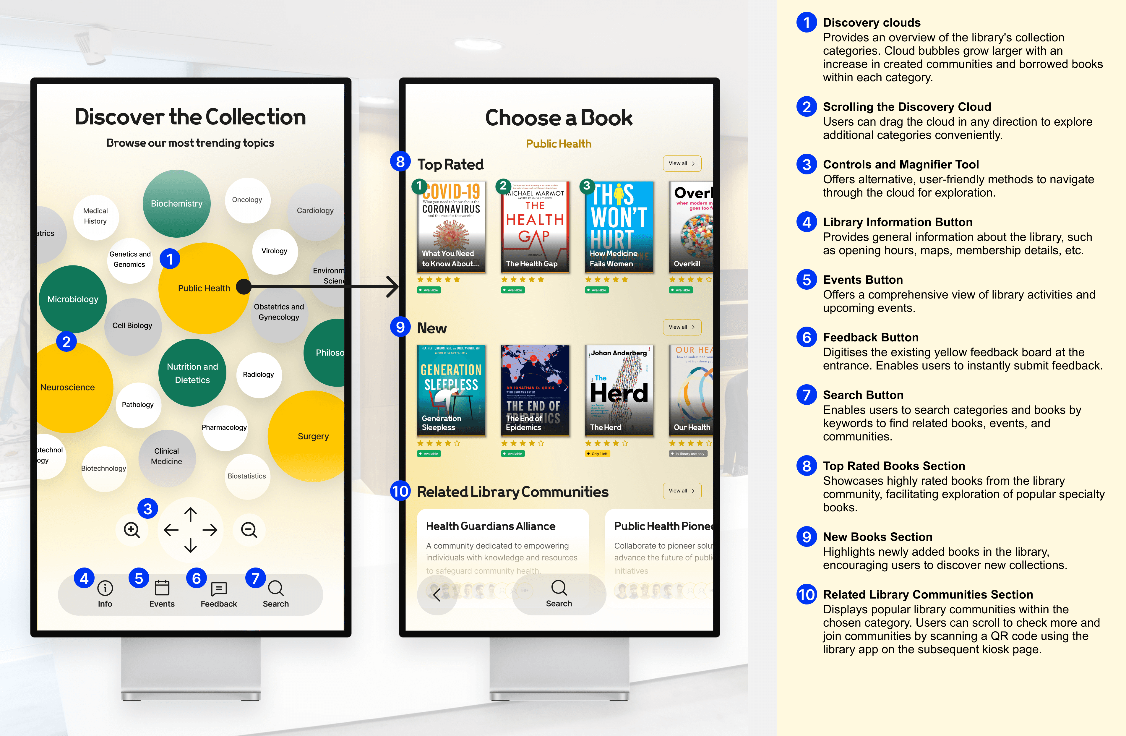
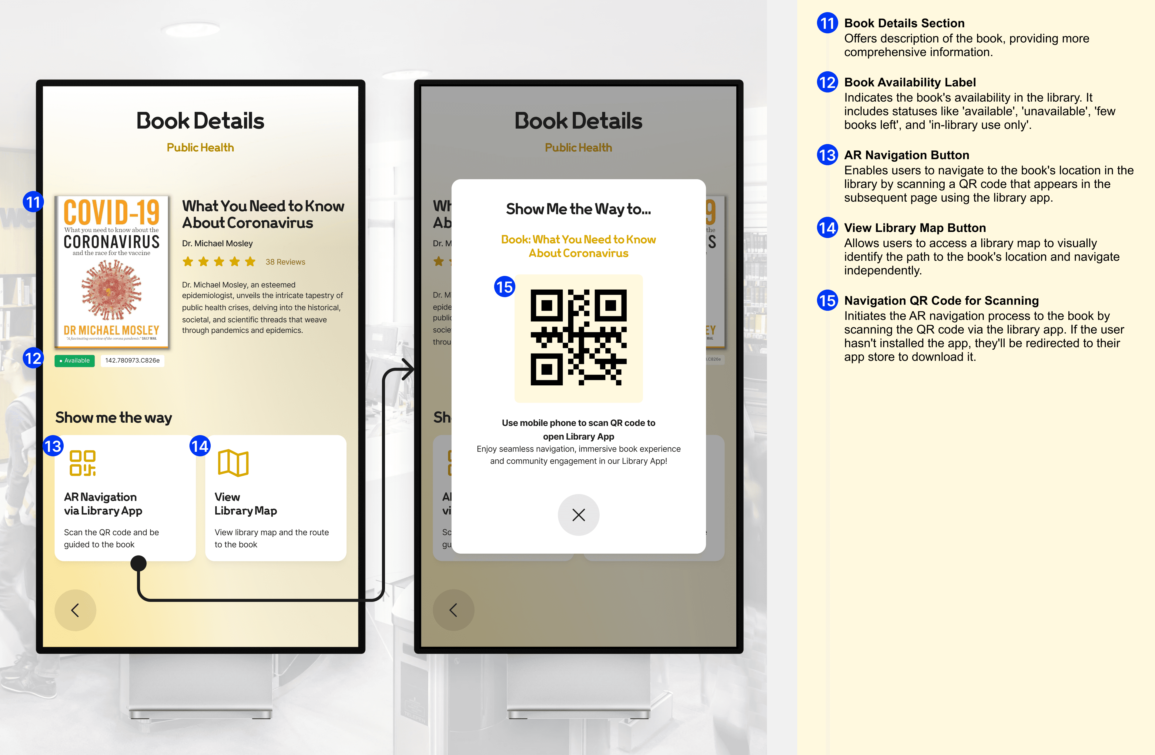
We developed a cross-platform digital system, including kiosk and mobile app interfaces, designed to encourage community interaction and streamline content discovery. Through iterative user research and testing, the system focused on intuitive navigation, re-finding mechanisms, and a user-friendly interface that catered to both visitors and staff.
User Research
We used a combination of naturalistic observation, interviews, and secondary research to gain a comprehensive understanding of library spaces, user behavior, and their interactions with available services. Our research uncovered key pain points, including difficulties in discovering relevant events and resources and a lack of a cohesive platform for community participation.

Naturalistic Observation

Interviews

Secondary Research
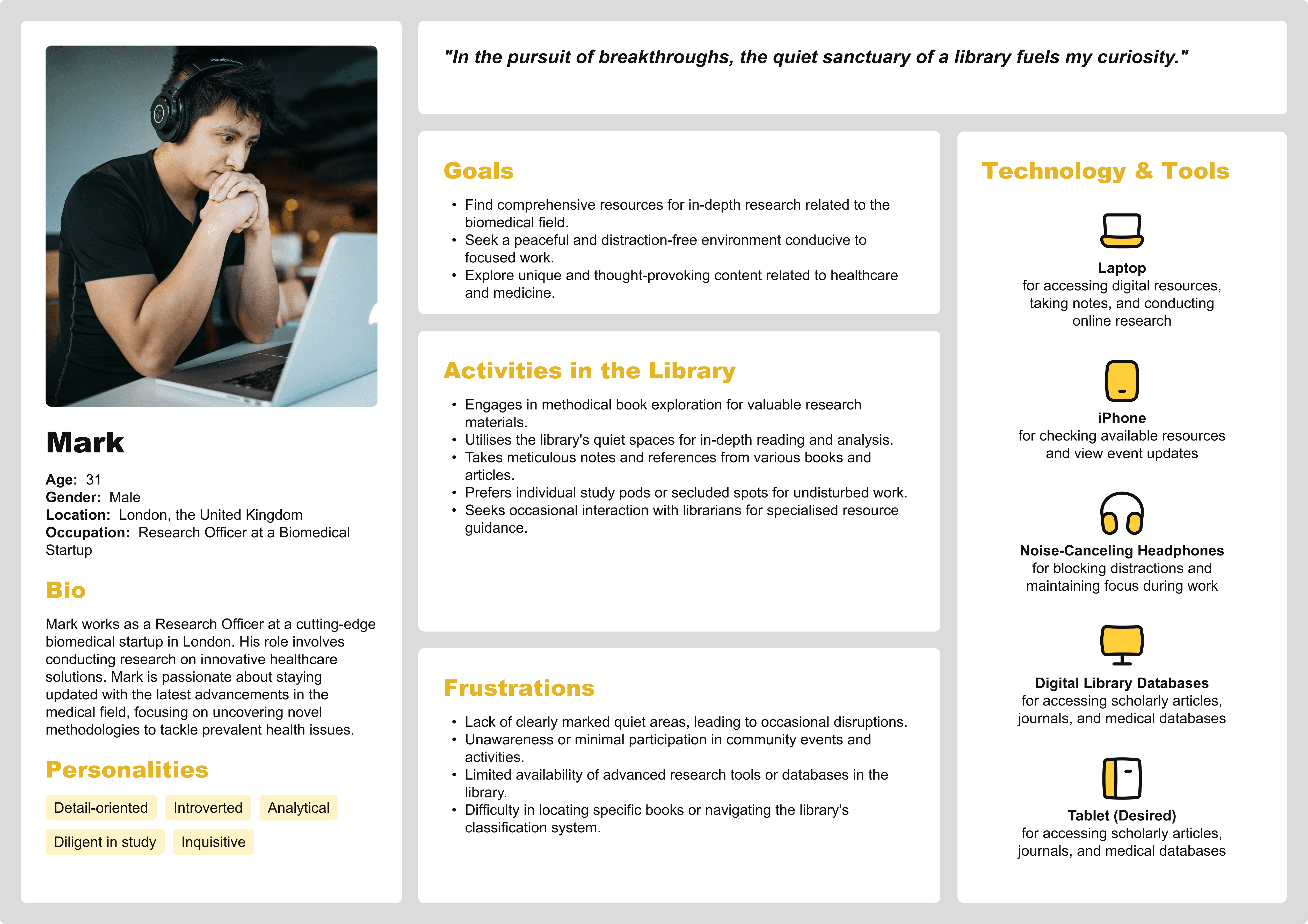
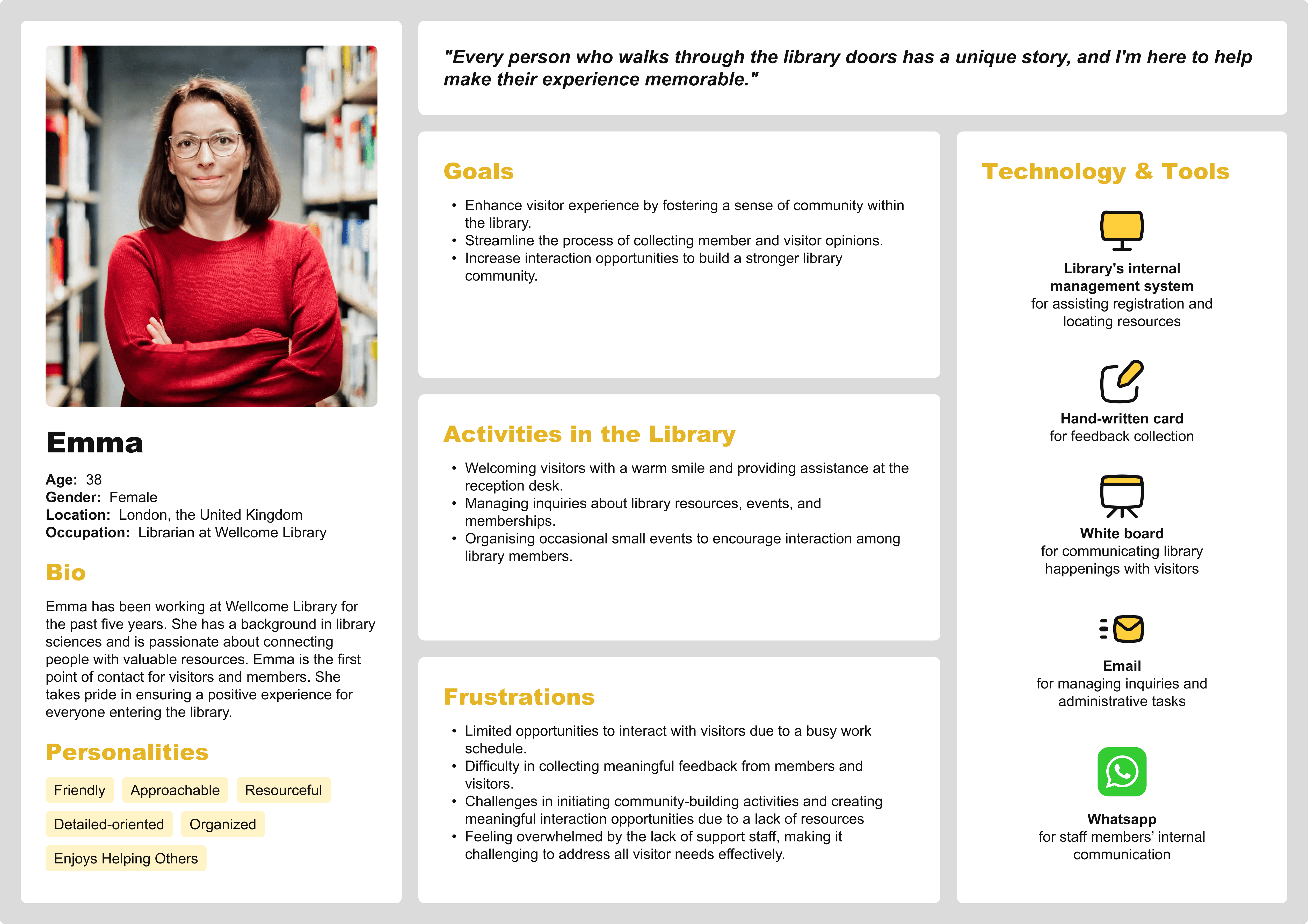
Our research insights were synthesised into affinity and empathy maps, and two core personas—visitor and staff—were developed to guide the design process.
Unexpectedly, we found that many library visitors, despite being frequent users, were unaware of existing digital services like event sign-ups and book suggestions. This indicated a deeper disconnect between users and the library’s potential offerings.
Affinity Mapping
Empathy Maps
Personas
Visitor
Staff
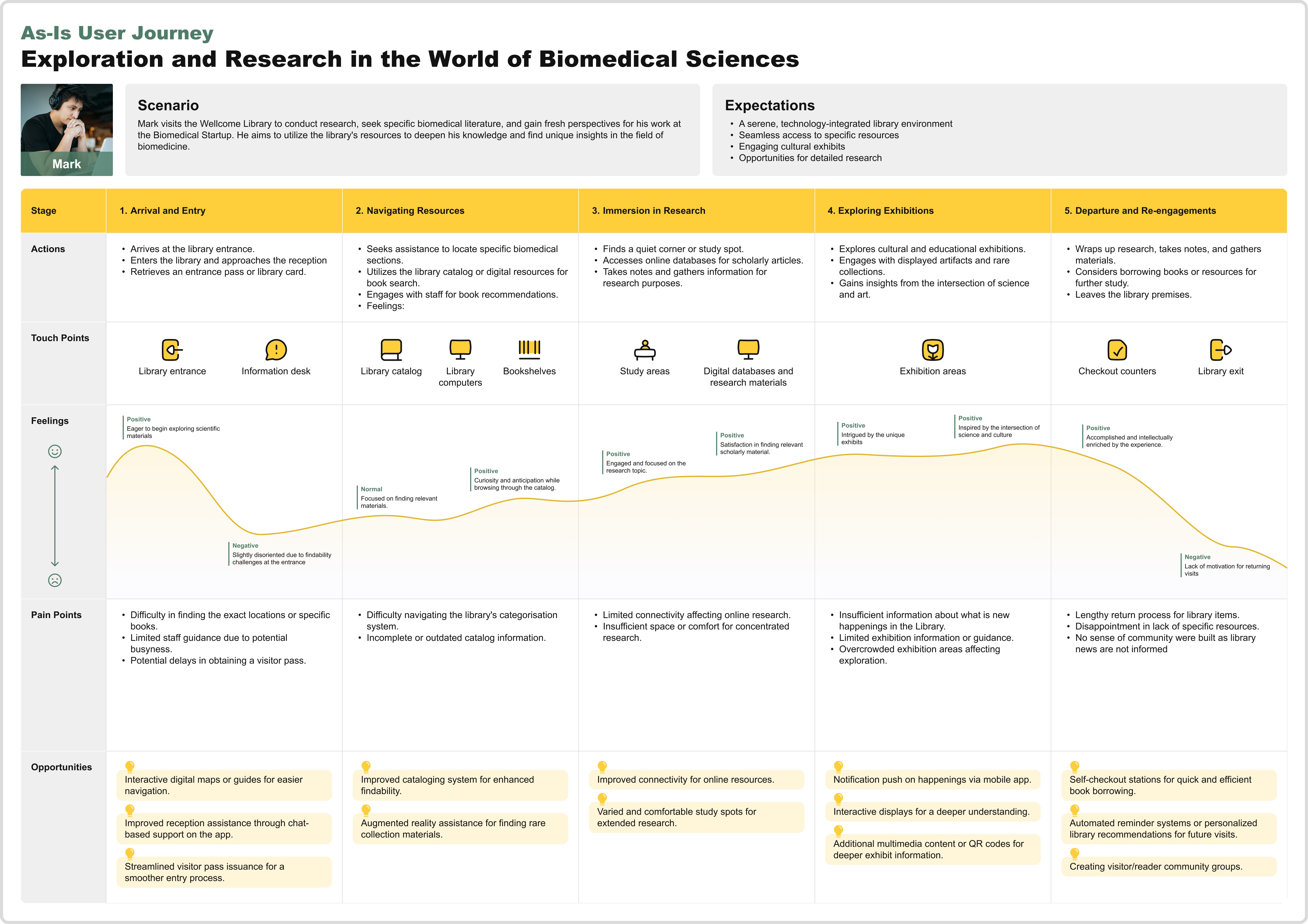
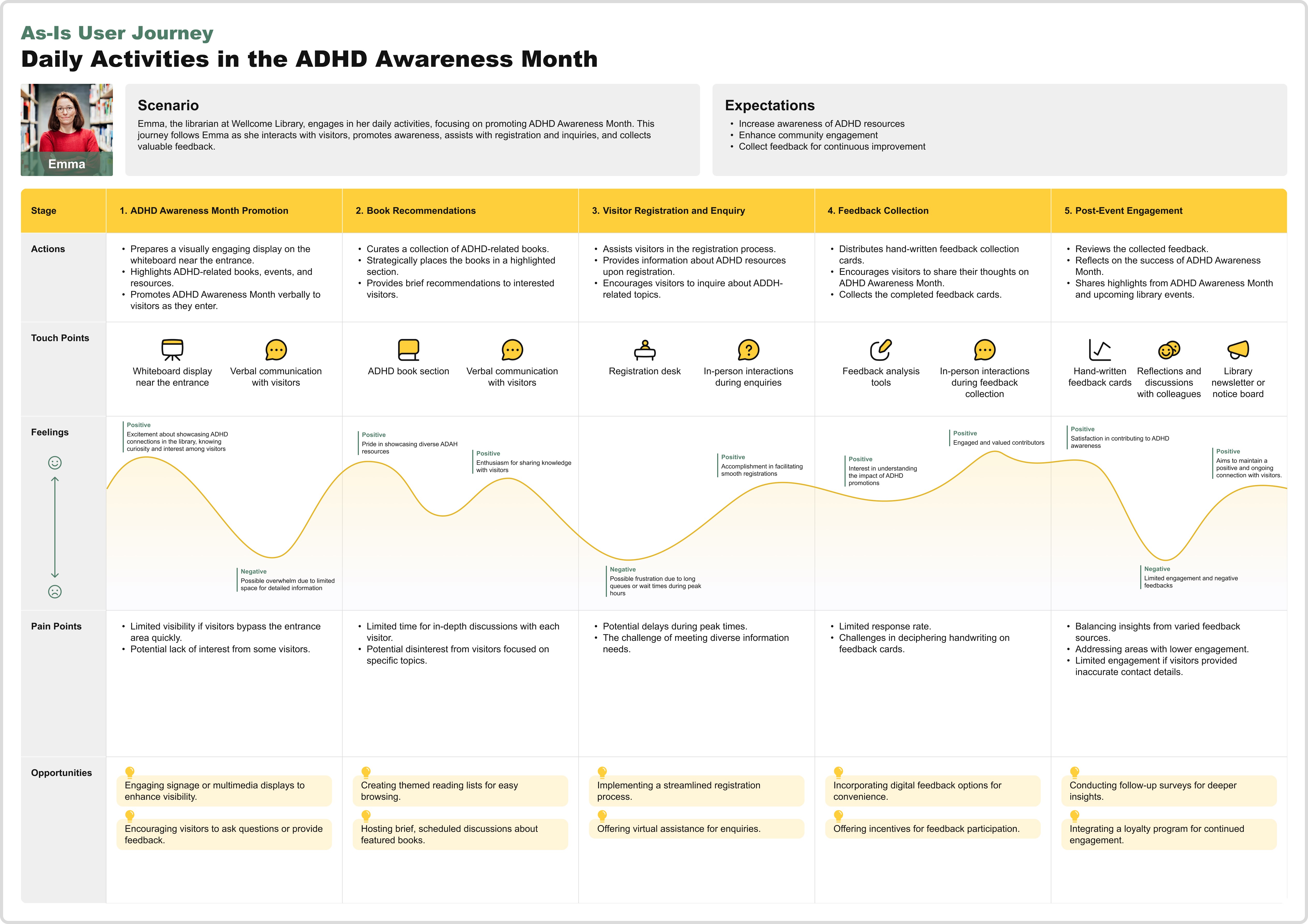
User Journey Maps
Visitor
Staff
Conceptual Design
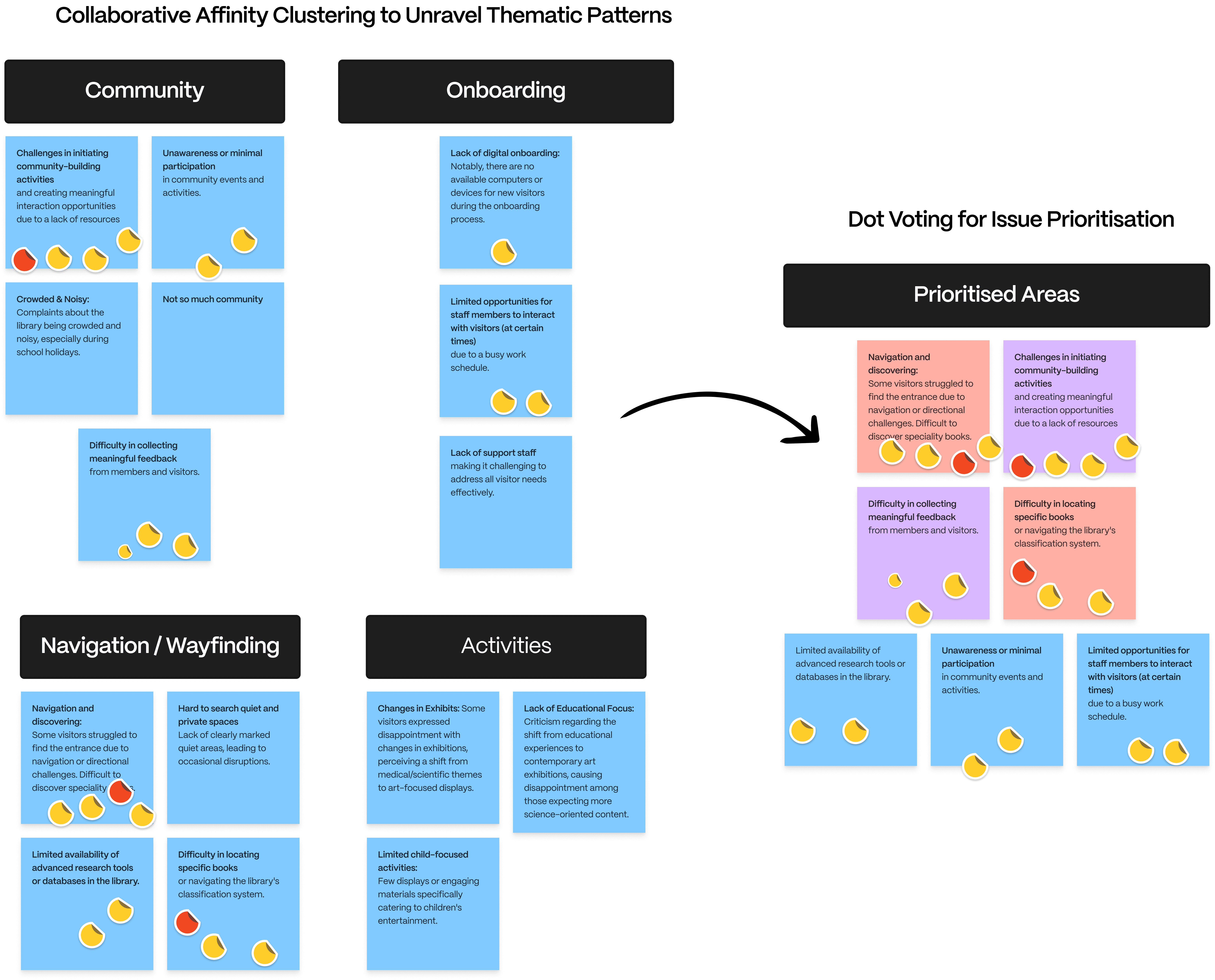
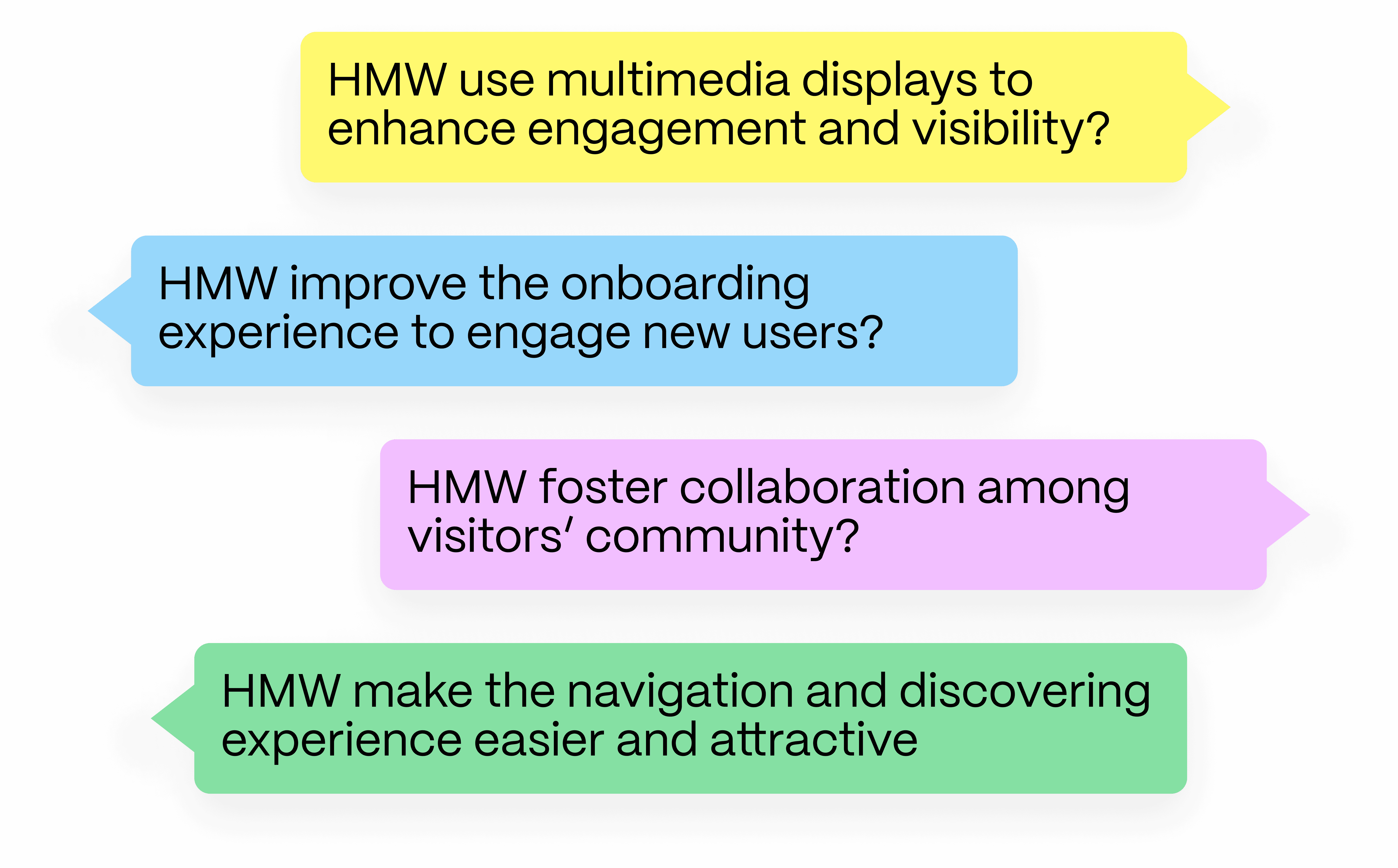
Our research findings significantly informed the conceptual design's direction towards specific goals. Through a three-day design thinking workshop, we generated ideas for fostering deeper user engagement. Using methods like Crazy 8s and How Might We (HMW) statements, we identified core opportunities, such as making event discovery more intuitive and creating social spaces for literary discussions. The storyboard visualized a seamless interaction between kiosks and mobile apps, fostering an environment where users could explore recommendations and interact with staff.
A notable challenge was aligning the digital experience with the existing analog culture of libraries, which required multiple iterations of the design to ensure it didn’t alienate traditional users.
Affinity Clustering
How Might We (HMW) Statements
Crazy 8's
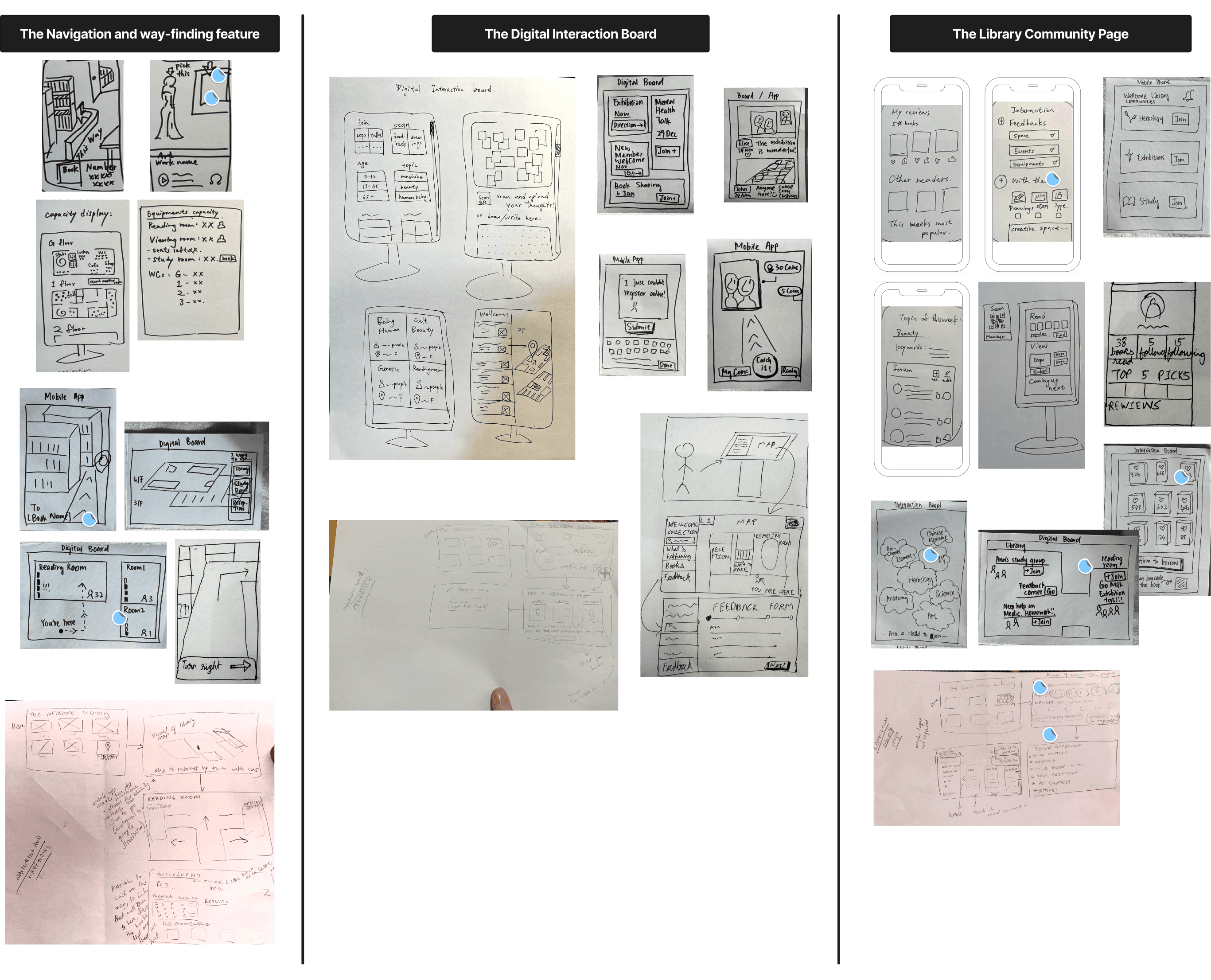
Storyboard
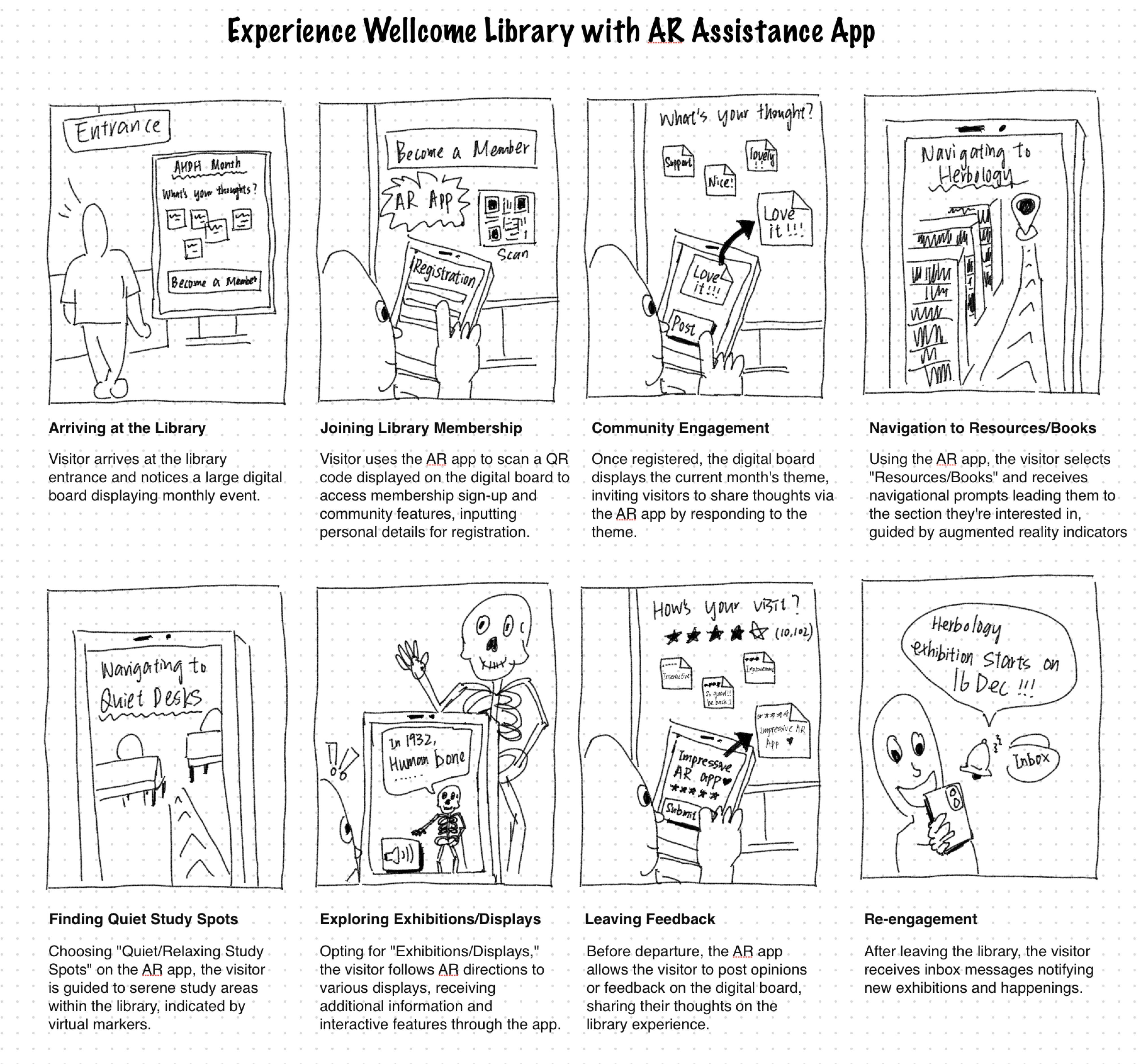
Detailed Design
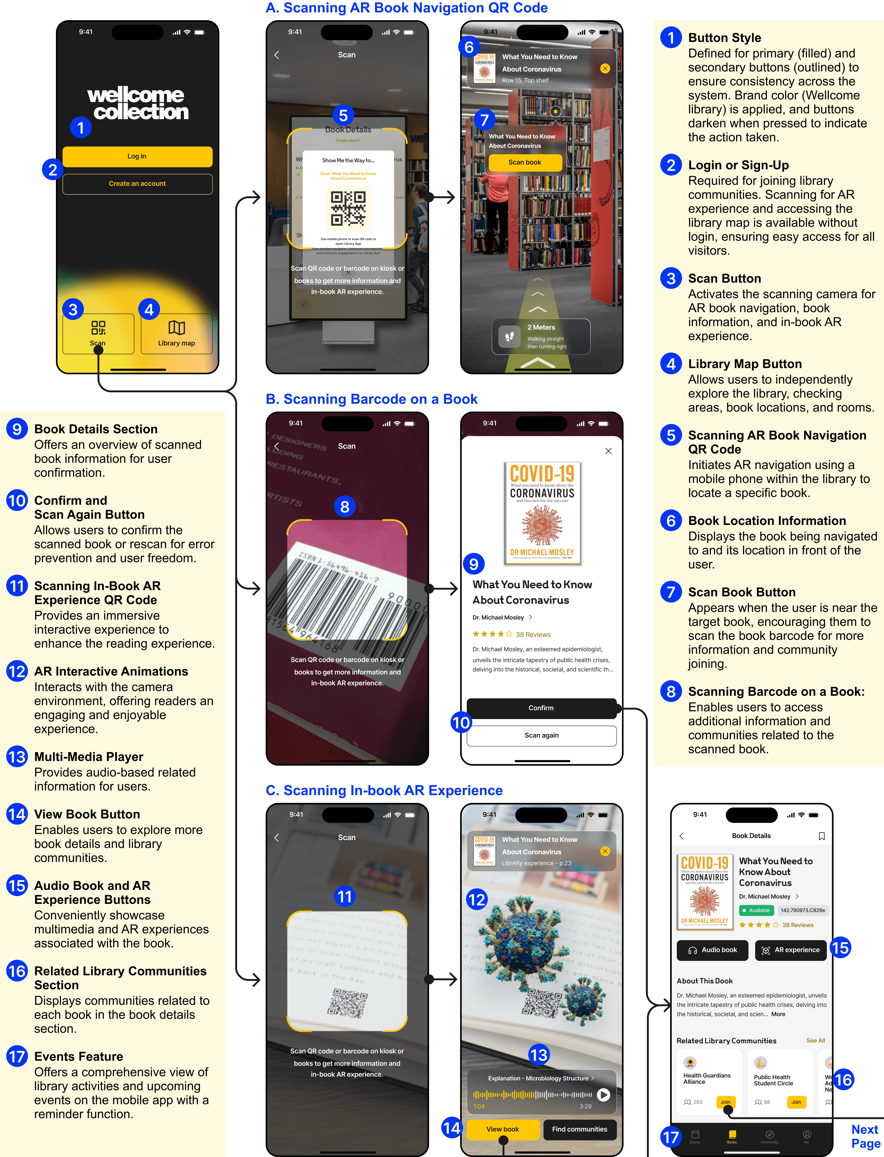
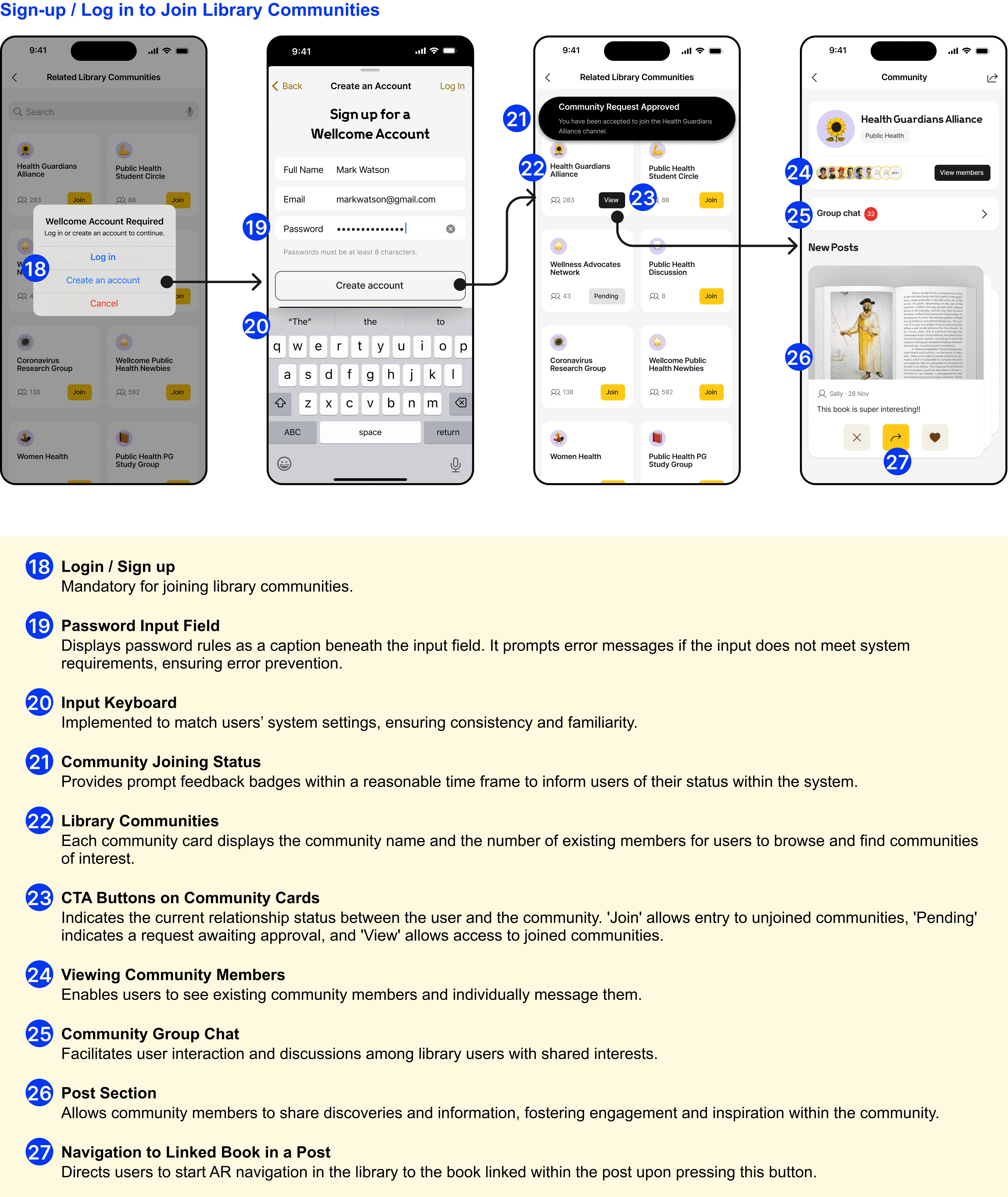
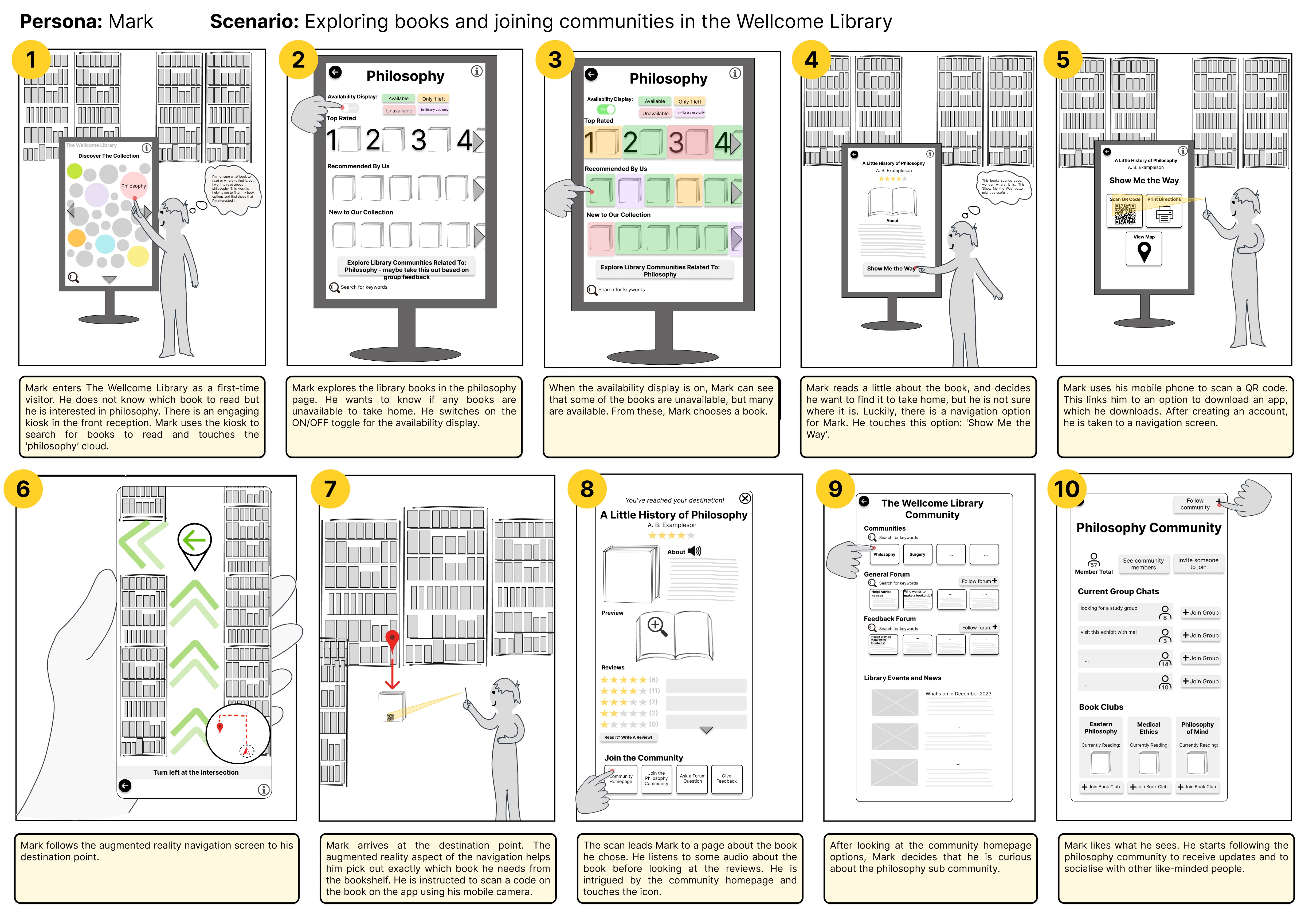
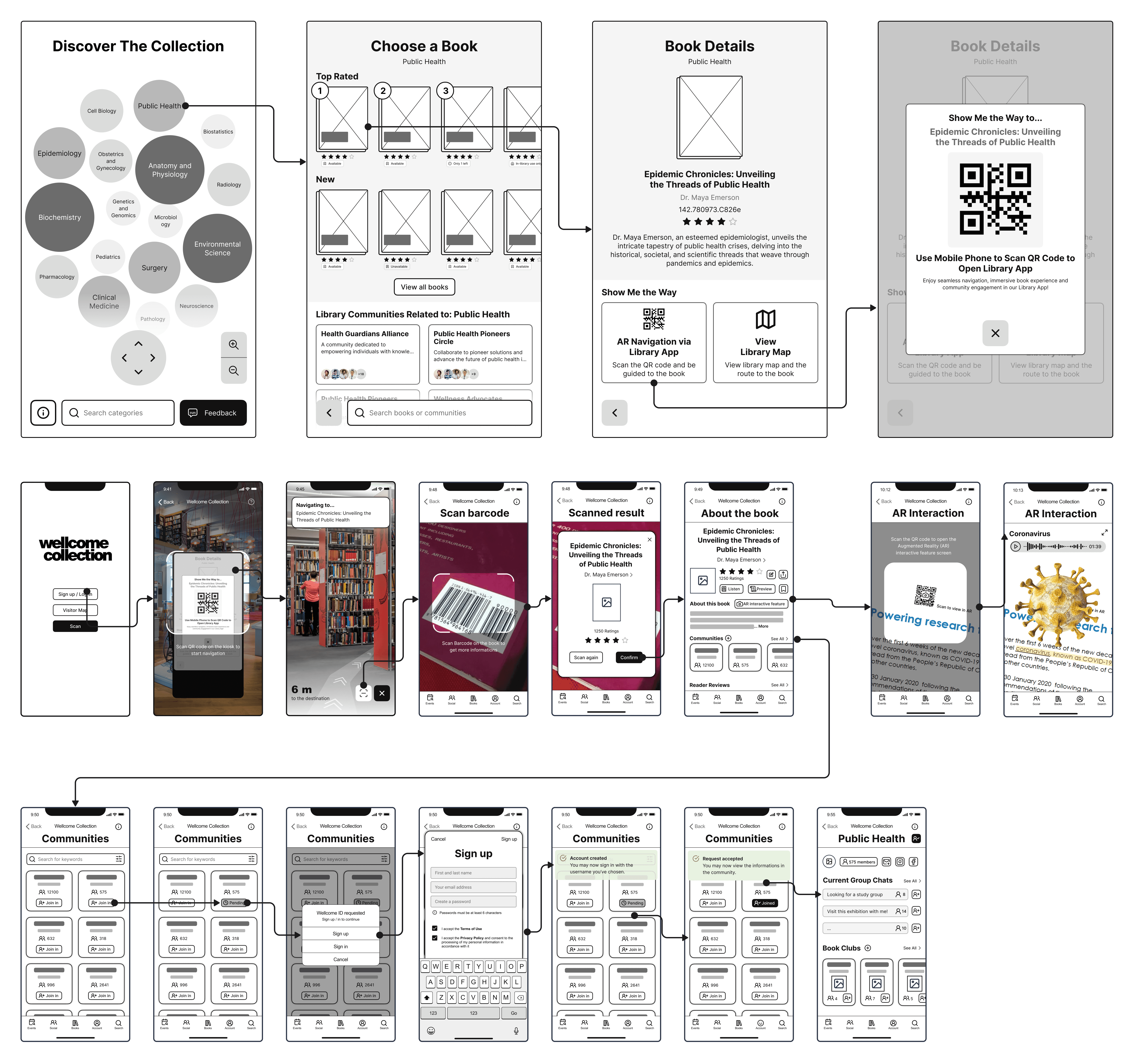
We created detailed user flows and wireframes, representing interactions across kiosks and mobile apps. The prototypes focused on easy-to-use interfaces for both visitors and staff, ensuring smooth navigation and intuitive content discovery.
One unexpected insight was the need for a more prominent re-finding mechanism—users expressed interest in a feature to bookmark or “save” their explorations for later, encouraging repeated visits.
The clickable prototype was developed to showcase this interaction, and it served as a central tool in user testing.
Storyboard
User Flow
Wireframes
Evaluation
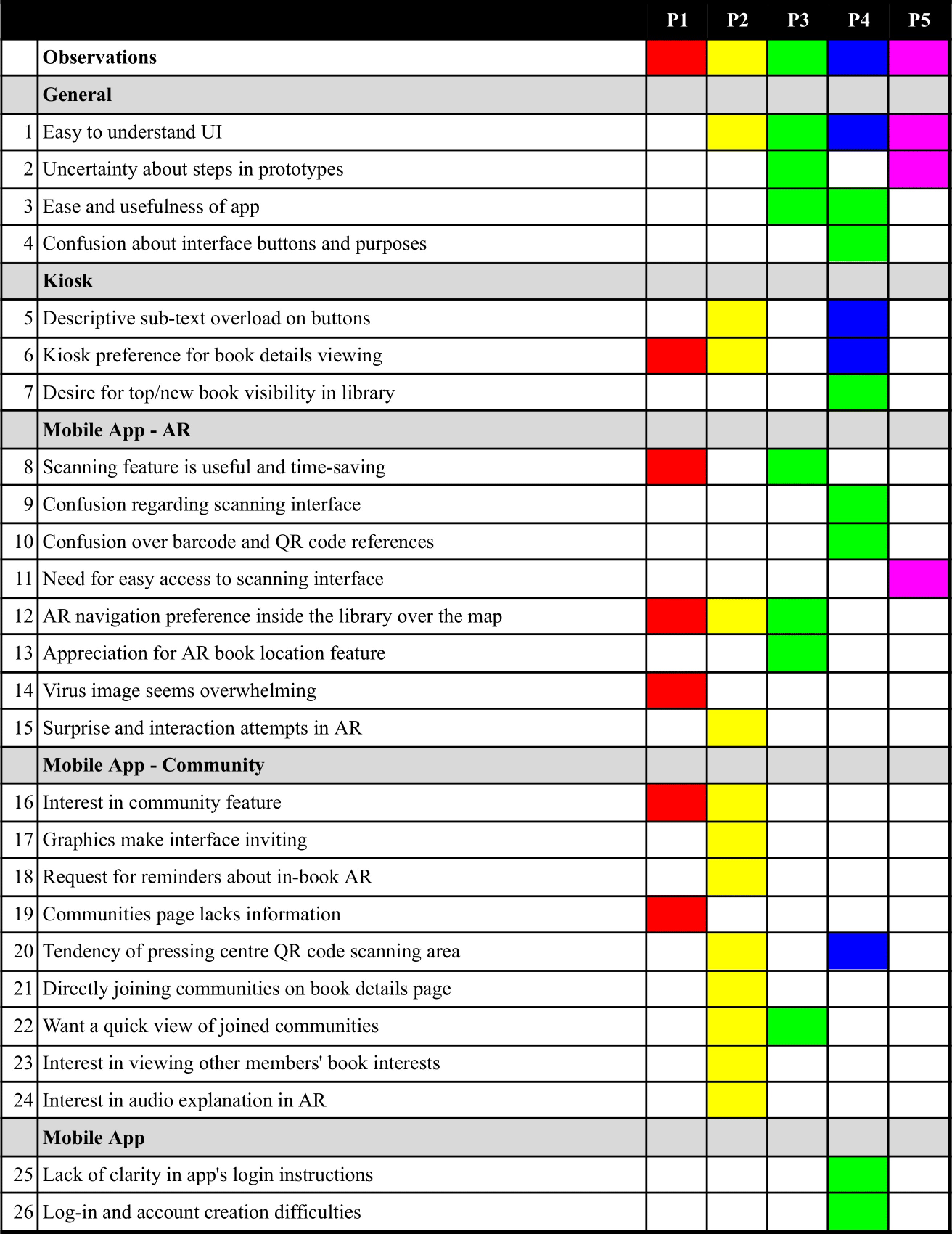
Usability testing with five participants revealed critical areas for improvement. A major issue was the lack of clarity in iconography, which led to confusion during navigation. Additionally, users struggled to find event details, reinforcing the importance of clear information architecture. Post-test questionnaires and the User Experience Questionnaire (UEQ) were used to gather both qualitative and quantitative data. We analysed the data from these tests using Schrepp's UEQ Analaysis Tool and by thinking of ways to overcome the most common negative experiences noted in the rainbow spreadsheet.
Using this feedback, we revised the prototype, particularly enhancing the kiosk experience by simplifying the event discovery process. This demonstrated how iterative testing is invaluable for refining user-centered solutions.
Rainbow Spreadsheet
UEQ Results
